This week, I went down to London to go and check out a new exhibition at the Wellcome Collection Gallery. The exhibition considers the role of graphic design in constructing and communicating healthcare messages around the world, and shows how graphic design has been used to persuade, to inform and to empower. As my dissertation is looking at some aspects related to alcohol and health, I wanted to see whether I could find anything that could help inform my own work.
Blank Cigarette Packaging - In the Context of Practice module I have been looking at the effect blank cigarette packaging has had, and how this could be developed to alcohol packaging. Build chose to present information on cigarette packaging as uniformly as possible in the machine-readable font OCR-B, adding a QR code linking to a website on quitting smoking.
Whilst I do not smoke, I feel that the cigarette packaging designs seen below are more attractive than the designs that have been implemented. The QR code is a fairly good idea for promoting the effects of smoking; however, people are unlikely to go out of their way to photograph the packaging and look it up. The design to the left is more effective in my view, as it directly gives the facts on the packaging. These are aspects that could be used to inform some of my CoP ideas.
Symbols - Design firm Poulin + Morris were commissioned to develop a communication tool to enable rapid, effective communication across language barriers between hospital patients and staff. Users point at easy-to-understand pictograms of symptoms, an alphabet or a simplified human figure to identify types of pain, its location and severity.
This type of design emphasises the importance of simplicity, and how effective it can be. The use of identifiable symbols and icons is successful in being understood by people in multiple countries, which is one aspect that I should consider when producing my own designs. Symbols and icons are a great alternative to using type, and are clearly effective in the health sector.
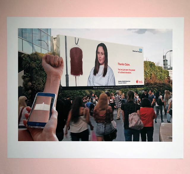
Augmented Reality - This NHS blood donor campaign uses augmented reality to allow members of the public to virtually donate their blood using their mobile phone. Participants are given a sticker detectable by visual recognition that overlays a needle, tube and plaster on their arm. The augmented reality app connects to a large outdoor advertising screen showing a sick patient attached to an empty blood bag - as the virtual blood fills the bag, the patient is shown returning to health.
The use of new technologies can have such a strong impact, clearly emphasised by this example. This year, I would like to research a bit more into technologies and what is out there, as innovative, interactive design is one area that is becoming more and more relevant.


